brief
- We aim to help clients grow and transform their business; suggesting new ways to engage with technology to improve the customer experience and their ROI
- We actively support client transformation, working as technology partners to provide support and mentorship through new ideas and ways of thinking
- Provide a collaborative work environment that allows everyone to fail forward, the opportunity to challenge themselves, learn and grow, and incorporate learning into future projects and initiatives for themselves and other teams.
The new visual identity needed to encompass our passion for growth and transformation whilst also alluding to continuous improvement. It needed to be forward-thinking and impactful whilst subtle enough to allow Butterfly’s portfolio to do the heavy lifting.
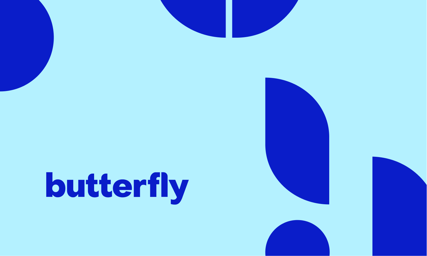
Referencing the 1960s was essential for the team, since this was the era when technology was transforming our perception of the world. Our goal was to create a visual identity and brand that represented Butterfly’s unique approach, reflected our future growth goals, and would endure the test of time.
As a company, our goal is to transform, so we need to make sure we do exactly what we say.
approach
The act of being your own client is tricky, you are either too close and invested or not enough, so we split this project into two teams, one delivery and one client, and established meeting rituals and clear outcomes from the start.
Prioritising and understanding our need for client work vs setting aside time for a large project of this size was key to our success. As a result, the project lead worked closely with the traffic manager and sales team to plan a consistent amount of time to work on this project by assessing the pipeline as well as client work in the studio. Further, the establishment of regular catch-ups and progress meetings was essential to getting things back on track when things changed–as they do!
KICK-OFF
As a result of our brand positioning workshop, we identified three fundamental principles that would guide us throughout the brand process. The new visual identity had to be innovative, clean and bold.
Research and stakeholder insights were then used to design a logo and supporting graphic mark that plays off the 1960's curves while being contemporary and forward-looking.MORE THAN JUST A LOGO
There is more to a brand than the logo, graphic mark, imagery, typography, or color. Brands are far more subjective. They're intangible concepts related to marketing or business that help people identify a company, product, or individual. Brand is the perception that your consumers have about you./p>
As much as it's easy to list out the elements that make up your visual identity or brand, it's much harder to communicate how you want the user to feel when these elements are brought together. Being able to communicate who Butterfly is and what we stand for is part of the challenge.
To complement the new identity, Butterfly undertook additional initiatives, such as reshaping their purpose, values, and mission. Our design uses the shapes of the graphic mark to create a monogram set that expresses a commitment to the company's culture and new values.
The new identities' bold shapes and vibrant colors set the foundation for any piece of work that needs to be created under the umbrella, enabling the brand to shine when needed or fade into the background when client work deserves the spotlight.BRAND GUIDELINES
The branding effort culminated in an extensive set of brand guidelines and reusable visual design assets. Our goal is to ensure that everyone feels confident not only in using the preset templates, but also creating new documents and designing unique documents or material in the future. Butterfly’s strong visual language and graphic elements allow the brand to be seen in multiple ways, whilst ensuring it remains fresh and can withstand company growth.
outcomes
An identity drawing inspiration from the past, that embodies the spirit of the 1950s and 1960s. At the time, man was about to walk on the moon, and there was great enthusiasm for the future and what we can achieve when we use our knowledge and technology. That’s what we stand for at Butterfly, we have learned from the past to help you transform the future, and that’s what our new branding represents.