brief
The Energy & Water Ombudsman NSW (EWON) is a government-approved resolution scheme for New South Wales that investigates and resolves complaints in NSW. They are committed to improving customer service in the energy and water industries.
Almost 20 years after its last branding, EWON’s blue logo no longer represented the company’s personality or attributes. It was important for EWON’s fresh look to convey the spirit of their brand without using physical images or icons.
Our brief was to design a visual identity that embodies the essence of EWON’s brand promise: “Progressive, independent, dispute resolution.”
approach
Every visual identity project begins with a discovery workshop. It was at this workshop that we developed our ideas, which soon flooded the page, each design attempting to convey the unique features of the organisation: approachable, informative, ethical, effective and progressive. EWON’s attributes included dispute resolution, outreach and public awareness, and influence on policy. We uncovered their ‘brand essence’.
VALUES WITH ROOT
The outcome of the ideation process is creativity, and we discovered by deconstructing the new logo that we could adapt the elements to form symbols of the organisation's values.
As a way of making each brand value both individually and collectively presentable, we created a secondary colour palette that complemented the primary brand colours.BRAND TOOLKIT
Any new visual identity should be accompanied by a set of tools designed to ensure consistency and flexibility. EWON's new brand style guide created a single truth for the brand, empowering them to communicate their brand essence and values consistently across all media.
COLLATERAL
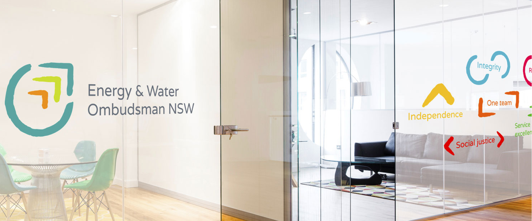
As part of maximising market recognition, the new branding was applied to all key marketing assets such as letterheads, business cards, and document covers. The new branding was also used when designing EWON's offices, allowing them to update their workspace with glass wraps that showcase the new branding and the organisation's values.
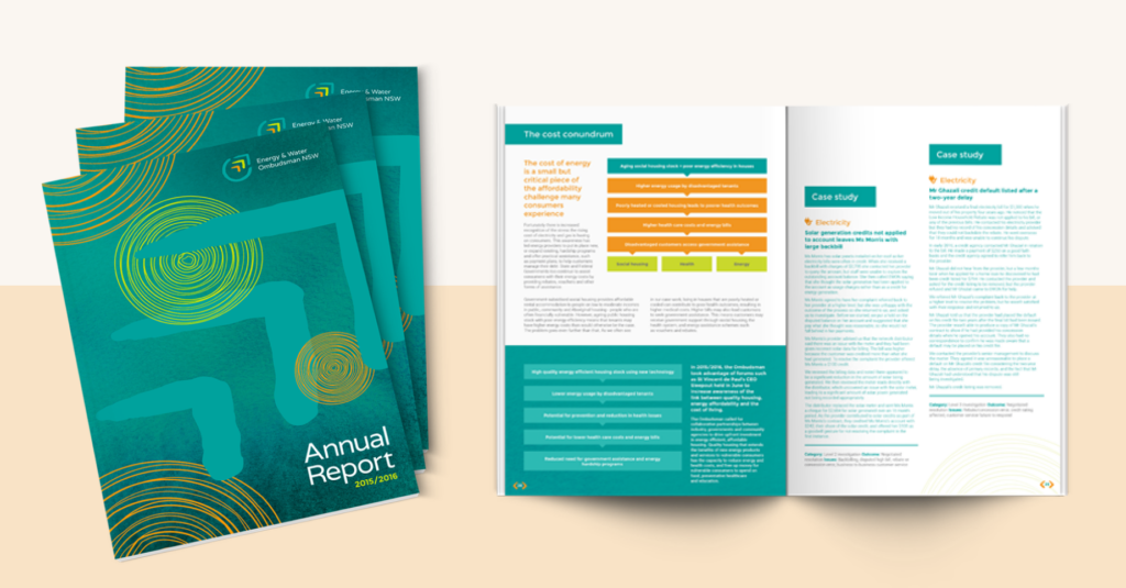
As one of EWON's most important documents, the annual report became the first showcase for the new brand. We ensured that every block of content worked harmoniously with the design.INDIGENOUS DESIGNS
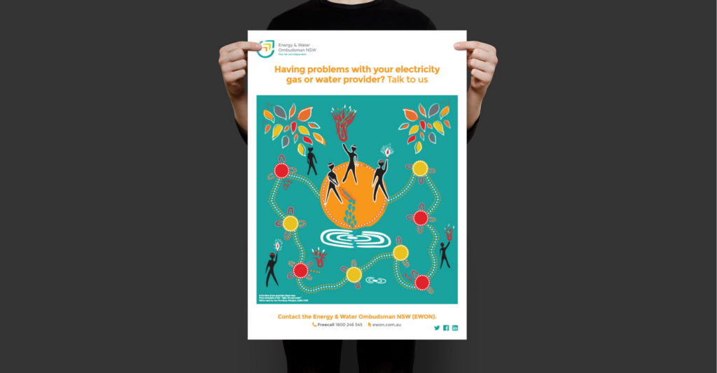
EWON is committed, as a culturally aware organization, to preserving the history and cultures of Aboriginal and Torres Strait Islander people. This was their personal wish to have this integrated into their new branding. We were privileged to have the opportunity to create an A3 poster based on Wiradjuri artist Vee Thornbury’s painting, Within Reach. By balancing our fresh idea with the symbolism of the original, we avoided disrupting the meaning of the piece.
outcomes
- A progressive brand personality built on approachability and not bureaucracy
- Integration of history and culture through Indigenous-inspired design
- A brand toolkit to ensure consistency across all brand materials